Modern identity
for a modern auto service center

We were approached by the company PRО.СТО, which provides car service in the Lviv region and the city of Lviv. Starting from a small car repair shop, they have grown into a modern service network and needed a transformation. The company provided comprehensive technical service, oil changes, and various repairs. Our task was to make their brand modern and recognizable, emphasizing its uniqueness.
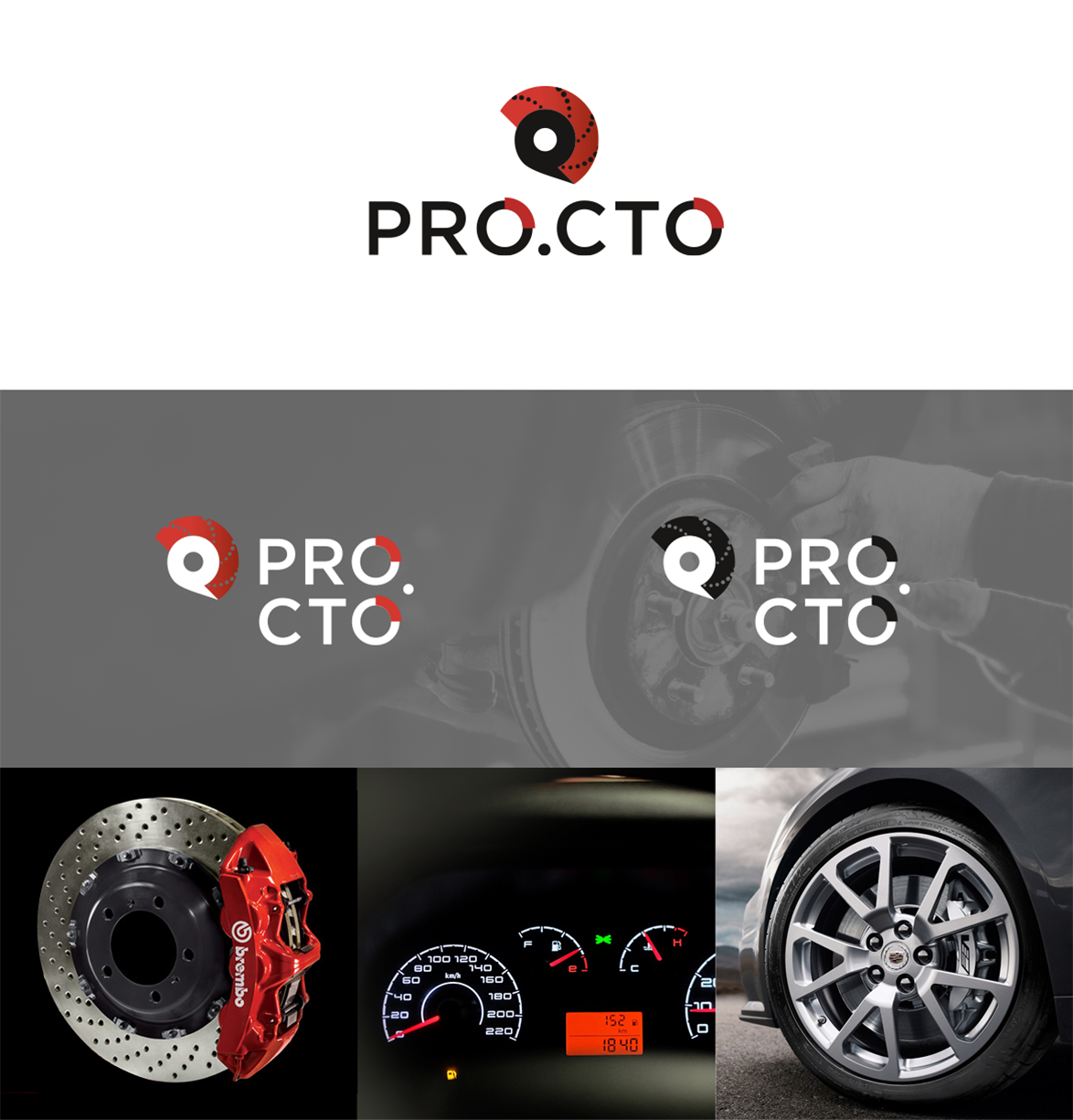
Focusing on the company's services, it was decided to use visual elements that convey the essence of their services at first glance. The logo is based on elements of the car: a speedometer arrow and a brake pad, as symbols of movement and safety. During the development process, additional meaning was added to these elements - the speedometer arrow was transformed into a location marker for the service centers.
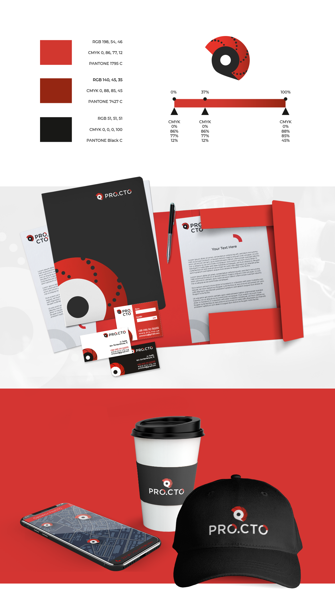
Orange-red on a black background, as the main colors, emphasized the energy, activity, and confidence of the brand to move forward.
